Download pivot table in excel
Pivot Table in Excel is a powerful data analysis tool that will help you quickly:
- Prepare data for reports;
- Calculate various indicators;
- Group data;
- Filter and analyze the metrics of interest.
And also save you tons of time.
In this article, you will learn:
- How to make summary table ;
- How to use a pivot table group time series and evaluate the data in dynamics by years, quarters, months, days ...
- How to calculate a forecast using a pivot table and Forecast4AC PRO;
First, let's learn how to make pivot tables.
In order to make a pivot table, we need to build the data in the form of a simple table. Each column must have 1 parsed parameter. For example, we have 3 columns:
- Product
- Sales in rubles
And in each line 3rd parameters are related, i.e. for example, 02/01/2010, Product 1 was sold for 422 656 rubles.

After you have prepared the data for the pivot table, set the cursor to the first column to the first cell of a simple table, then go to the "Insert" menu and press the button "Pivot table"

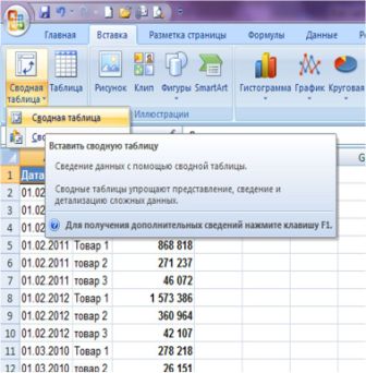
A dialog box will appear in which:
- you can immediately press the "OK" button, and the pivot table will be displayed in a separate sheet.
- or you can configure the parameters of the pivot table data output:
- Range with data to be displayed in the pivot table;
- Where to display the pivot table (to a new sheet or to an existing one (if you select to an existing one, you will need to specify the cell in which you want to place the pivot table)).

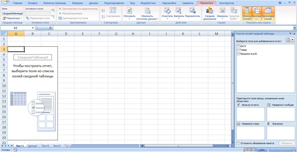
Click "OK", the pivot table is ready and displayed in a new sheet. Let's call the sheet Pivot.
- On the right side of the sheet, you will see fields and areas that you can work with. You can drag the fields to the areas and they will be displayed in the pivot table on the sheet.
- On the left side of the sheet is a pivot table.
Now, hold down the "Product" field with the left mouse button - drag it to the "Line names", the "Sales in rubles." - in "Values" in the pivot table. Thus, we received the total sales by goods for the entire period:

Grouping and filtering time series in a pivot table
Now, if we want to analyze and compare product sales by years, quarters, months, days, then we need add relevant fields to pivot table.
To do this, go to the "Data" sheet, and after the date insert 3 empty columns. Select the "Product" column and click "Insert".
Importantso that the newly added columns are inside the range of an existing table with data, then we will not need to redo the pivot to add new fields, it will be enough to update it.
The inserted columns are called "Year", "Month", "Year-Month".
Now, in each of these columns, add the appropriate formula to get the time parameter of interest:
- Add the formula to the "Year" column \u003d YEAR (with reference to the date);
- Add the formula to the "Month" column \u003d MONTH (with reference to the date);
- Add the formula to the "Year - Month" column \u003d CONCATENATE (link to year; ""; link to month).
We get 3 columns with year, month and year and month:

Now go to the "Summary" sheet, place the cursor on the pivot table, right-click the menu and press the "Update" button... After the update in the list of fields, we have new pivot table fields "Year", "Month", "Year - month", which we added to simple table with data:
![]()
Now let's analyze the sales by year.
To do this, we drag the "Year" field into the "column names" of the pivot table. We get a table with sales by product by year:

Now we want to "go down" even deeper to the level of months and analyze sales by years and by months. To do this, drag the month field under the year into the "column names":

To analyze the dynamics of months by years, we can move the months to the pivot area "Row names" and get the following view of the pivot table:
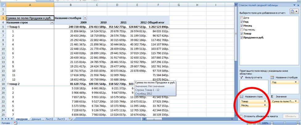
In this pivot table view, we see:
- sales for each product in the amount for the whole year (line with the name of the product);
- in more detail sales for each product in each month in dynamics for 4 years.
Next challenge, we we want to remove sales for a month from the analysis (for example, October 2012), because we do not have sales data for a full month yet.
To do this, drag "Year - month" to the pivot "Report filter"
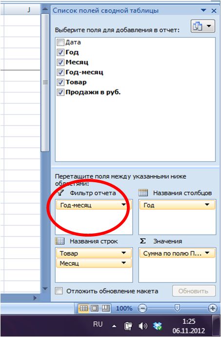
Click on the summary filter that appears above and check the box "Select multiple elements"... Then, in the list with years and numbers of months, uncheck 2012 10 and click OK.

Thus, you can add new parameters for changing the time and analyze those time periods that are interesting to you and in the form in which you need it. The pivot table will calculate indicators for those fields and filters that you set and add to it as a field of interest.
Calculating pronoz using pivot table and Forecast4AC PRO
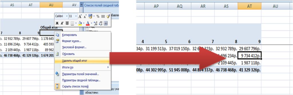
Let's build sales using a pivot table by product, by year and by month. We will also turn off the grand totals so that they are not included in the calculation.
In order to turn off the totals in the pivot table, place the cursor on the "Total" column and click on the "Delete total" button. The total disappears from the summary.

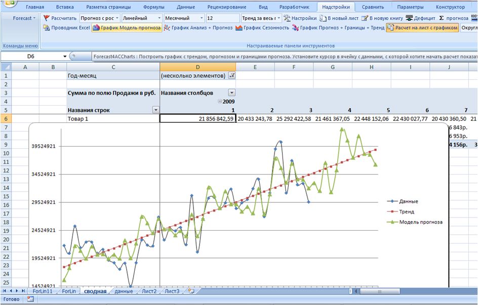
and press the "Forecast Model Chart" button in the Forecast4AC PRO menu
We get the calculation of the forecast for 12 months and a beautiful graph with the analysis of the forecast model (trend, seasonality and model) relative to the actual data. Forecast4AC PRO can calculate forecasts, seasonality rates, trend and other indicators for you and build graphs based on the data displayed in the pivot table.
PivotTable in Excel is a powerful data analysis tool that allows you to quickly calculate metrics and build data in the form you are interested in quickly and easily.
If you've never used a spreadsheet to create documents before, we recommend reading our Excel guide for dummies.
Then you can create your first spreadsheet with tables, graphs, math formulas and formatting.
Detailed information on basic functions and capabilities table processor MS Excel. Description of the main elements of the document and instructions for working with them in our material.

Working with cells. Padding and formatting
Before proceeding with specific actions, you need to understand basic element any document in Excel. An Excel file consists of one or more sheets divided into small cells.
A cell is a basic component of any Excel report, spreadsheet or graph. Each cell contains one block of information. It can be a number, date, currency, unit of measure, or other data format.
To fill in a cell, just click on it with the pointer and enter the required information. To edit a previously filled cell, double-click on it.
Figure: 1 - an example of filling cells
Each cell on the sheet has its own unique address. Thus, you can carry out calculations or other operations with it. When you click on a cell, a field with its address, name and formula will appear at the top of the window (if the cell is involved in any calculations).
Let's select the cell "Share of shares". Its location address is A3. This information is indicated in the properties panel that opens. We can also see the content. This cell has no formulas, so they are not shown.
More cell properties and functions that can be used in relation to it are available in the context menu. Click on the cell with the right key of the manipulator. A menu will open with which you can format the cell, analyze the content, assign a different value, and other actions.
Figure: 2 - context menu of a cell and its main properties
Sorting data
Often users are faced with the task of sorting data on a sheet in Excel. This feature helps you quickly select and view only the data you want from the entire table.
Before you is an already completed table (we will figure out how to create it later in the article). Imagine that you want to sort the data for January in ascending order. How would you do it? A banal retyping of a table is an extra work, besides, if it is voluminous, no one will do it.
Excel has a special function for sorting. The user is only required to:
- Select a table or block of information;
- Open the "Data" tab;
- Click on the "Sort" icon;
Figure: 3 - "Data" tab
- In the window that opens, select the column of the table, over which we will carry out actions (January).
- Next, the sorting type (we are grouping by value) and, finally, the order is ascending.
- Confirm the action by clicking on "OK".
Figure: 4 - setting sorting parameters
The data will be automatically sorted:
Figure: 5 - the result of sorting the digits in the column "January"
Similarly, you can sort by color, font and other parameters.
Mathematical calculations
The main advantage of Excel is the ability to automatically carry out calculations in the process of filling out the table. For example, we have two cells with values \u200b\u200b2 and 17. How can we enter their result into the third cell without doing the calculations ourselves?
To do this, you need to click on the third cell in which the final result of the calculations will be entered. Then click on the function icon f (x) as shown in the figure below. In the window that opens, select the action you want to apply. SUM is the sum, AVERAGE is the average, and so on. Full list functions and their names in the Excel editor can be found on the official website of Microsoft.
We need to find the sum of two cells, so we click on "SUM".
Figure: 6 - selection of the "SUM" function
The function arguments window has two fields: "Number 1" and "Number 2". Select the first field and click on the cell with the number "2". Its address will be written to the argument string. Click on "Number 2" and click on the cell with the number "17". Then confirm the action and close the window. If you need to perform math with three or more boxes, just keep entering the argument values \u200b\u200bin the Number 3, Number 4, and so on.
If in the future the value of the summed cells changes, their sum will be updated automatically.
Figure: 7 - the result of the calculations
Creating tables
Any data can be stored in Excel tables. With the help of the quick setup and formatting function, it is very easy in the editor to organize a personal budget control system, a list of expenses, digital data for reporting, and more.
Tables in Excel take precedence over the similar option in Word and other office programs. Here you have the opportunity to create a table of any dimension. The data is filled in easily. There is a function panel for editing content. In addition, ready table can be integrated into a docx file using the usual copy-paste function.
To create a table, follow the instructions:
- Click the Insert tab. On the left side of the options pane, select Table. If you need to summarize any data, select the item "Pivot table";
- Using the mouse, select a place on the sheet that will be allocated for the table. And also you can enter data location in the element creation window;
- Click OK to confirm the action.
Figure: 8 - creating a standard table
To format appearance of the resulting plate, open the contents of the constructor and in the "Style" field click on the template you like. If desired, you can create your own look with a different color scheme and cell selection.
Figure: 9 - table formatting
The result of filling the table with data:
Figure: 10 - filled table
For each cell in the table, you can also customize the data type, formatting and information display mode. The designer window contains all the necessary options for further configuration of the plate, based on your requirements.
Adding graphs / charts
To build a chart or graph, a ready-made plate is required, because the graphic data will be based precisely on information taken from individual lines or cells.
To create a chart / graph, you need:
- Select the table completely. If you need to create a graphic element only for displaying data certain cells, select only them;
- Open the insert tab;
- In the recommended charts box, select the icon that you think will best visually describe the tabular information. In our case, this is a 3-D pie chart. Move the pointer to the icon and select the appearance of the element;
Similarly, you can create scatter plots, line charts, and table element dependencies. All received graphic elements can also be added to text documents Word.
There are many other functions in the Excel spreadsheet editor, however, the techniques described in this article will suffice for initial work. In the process of creating a document, many users independently master more advanced options. This is due to a user-friendly and intuitive interface. latest versions programs.
Thematic videos:
The PivotTable is perhaps the most useful tool in Excel. With its help, there are ample opportunities for analyzing large amounts of data and fast calculations.
What are Pivot Tables in Excel? Pivot tables in Excel for dummies
PivotTables are an Excel tool for summarizing and analyzing large amounts of data.
Let's say we have a 1000-line table of sales by customer for the year:
The table shows:
- Dates of orders;
- The region where the client is located;
- Client type;
- Client;
- Number of sales;
- Revenue;
- Profit.
Now, let's imagine that our manager has set tasks to calculate:
- TOP five clients by revenue;
You can use various functions and formulas to find the answer to these questions. But what if there are not three, but thirty tasks for this data? Each time you have to change formulas and functions and adjust for each type of calculation.
This is just the case in which the PivotTable tool will become an indispensable assistant for you. With its help, you can answer any question in a matter of seconds, according to the data from the table.
I hope you realized, in the example above, how useful and necessary a pivot table is. Let's figure out how to use them.
How to make a pivot table in Excel
To create a pivot table in Excel follow these steps:
- Select any cell in the table with the data on the basis of which you want to make a pivot table;
- Click on the “Insert” tab \u003d\u003e “Pivot Table”:

- In the pop-up dialog box, the system will automatically determine the data boundaries based on which you can create a pivot table. This method works by default in most cases. I recommend that each time you create a pivot table, make sure that the system has correctly defined the parameters for its creation:
- Table or Range: The system automatically detects data boundaries to create a pivot table. They will be correct provided that there are no spaces in the headers and lines in the table. You can adjust the data range as needed. - The system by default creates a table in a new tab excel file... If you want to create it in a specific place on a specific sheet, then you can specify the boundaries to create in the column “On existing sheet”.
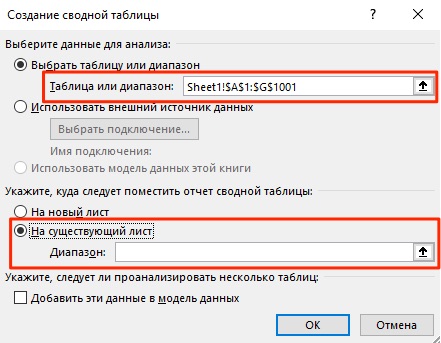
- Click “OK”.
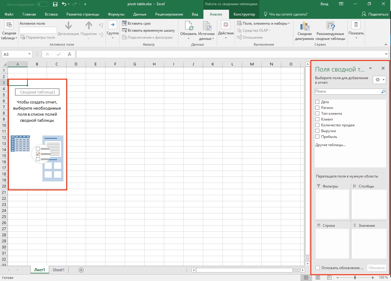
After you clicked the “OK” button, the pivot table will be created.
Once the pivot table is created, you will not see any data on the sheet. All that will be available is the name of the pivot table and the menu for selecting data to display.
Now, before we start analyzing the data, I propose to understand what each field and area of \u200b\u200bthe pivot table means.
Pivot table regions in Excel
In order to use pivot tables effectively, it is important to thoroughly know how they work and what it consists of.
Find out more about the areas below:
- Pivot table cache
- Values \u200b\u200barea
- Strings area
- Columns area
- Filters area
What is pivot table cache
When you create a PivotTable, Excel creates a cache (quick-access intermediate data buffer containing the information that is most likely to be requested) of the data from which the table will be built.
When you perform calculations on the created table, Excel does not refer to the original data every time, but uses information from the cache. This feature significantly reduces the amount of system resources spent on processing and computing data.
It is important to remember that the data cache increases the size of the Excel file.
Values \u200b\u200barea
The Values \u200b\u200barea contains all the values \u200b\u200bof the table and can be displayed as the main component of the pivot table. Imagine that we want to display the sales of regions by month (from the example at the beginning of the article) using a pivot table. Shaded values yellow in the image below and are the values \u200b\u200bthat we specify in the pivot table in the "Values" area.
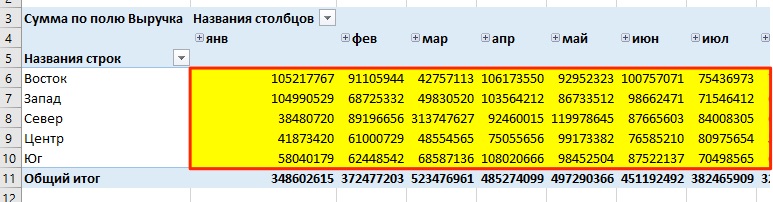
In the example above, we have created a pivot table that displays sales data by region, broken down by month.
Strings area
Table headers to the left of the values \u200b\u200bare rows. In our example, these are the names of the regions. In the screenshot below, the lines are highlighted in red:

Columns area
The headings at the top of the table values \u200b\u200bare called “Columns”.
In the example below, the fields “Columns” are highlighted in red, in our case these are the values \u200b\u200bof months.

Filters area
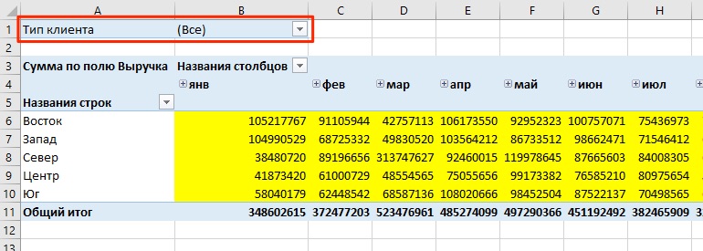
The "Filters" area is optional and allows you to set the level of detail for the pivot table data. For example, we can specify the data “Type of customer” - “Grocery store” as a filter and Excel will display data in the table concerning only grocery stores.
Pivot tables in Excel. Examples of
In the examples below, we'll look at how to use pivot tables to answer three questions from the beginning of this article:
- What is the volume of revenue for the North region in 2017 ?;
- TOP five clients by revenue;
- What is the place of the Ludnikov IP client in the Vostok region in terms of revenue?
Before analyzing the data, it is important to decide how the table data should look (what data to mark up in columns, rows, values, filters). For example, if we need to display customer sales data by region, then we should put the names of regions in rows, months in columns, sales values \u200b\u200bin the “Values” field. Once you have an idea of \u200b\u200bhow you see the final pivot table, start creating it.
The "PivotTable Fields" window contains areas and fields with values \u200b\u200bto be placed in the pivot table:
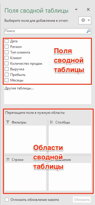
The fields are created based on the original data used for the pivot table. The Areas section is where you place the fields, and according to which area the field will be placed in, your data is updated in the pivot table.
Moving fields from area to area is a convenient interface in which, as you move, the data in the pivot table is automatically updated.

Now, let's try to answer the manager's questions from the beginning of this article with the examples below.
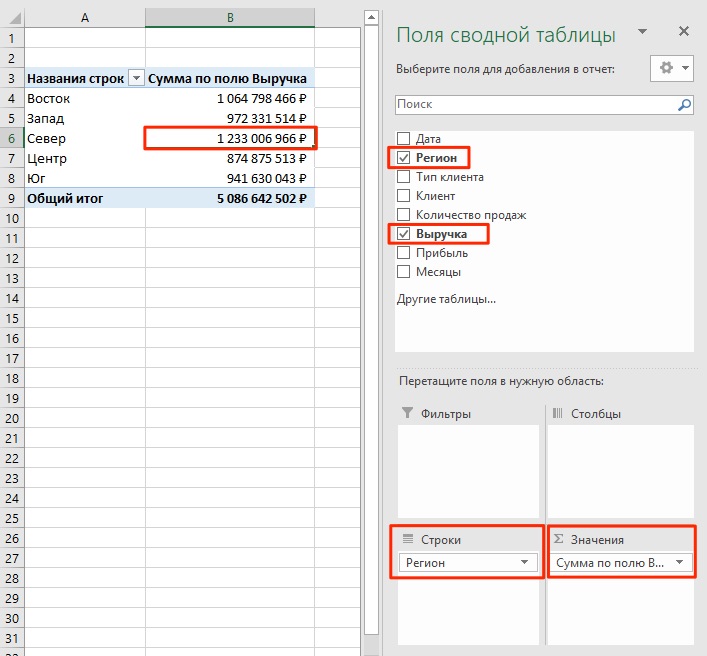
Example 1. How much revenue does the North region have?
In order to calculate the sales volume of the North region, I suggest placing the sales data of all regions in the pivot table. For this we need:
- create a pivot table and move the "Region" field to the "Rows" area;
- place the field “Revenue” in the area “Values”
We will get the answer: the sales of the North region are 1 233 006 966 ₽:
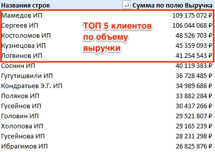
Example 2. TOP five customers by sales
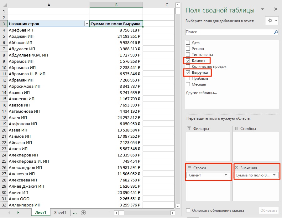
- in the pivot table, move the “Customer” field to the “Rows” area;
- place the “Revenue” field in the “Values” area;
- set a financial number format to pivot table cells with values.
We will have the following pivot table:
By default, Excel sorts the data in the table in alphabetical order. In order to sort the data by sales volume, follow these steps:
- go to the menu “Sort” \u003d\u003e “Sort descending”:
![]()
As a result, we will get a sorted list of customers by revenue.
Example 3. What is the place in terms of revenue of the client Ludnikov IE in the Vostok region?
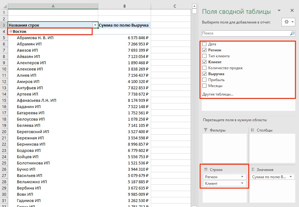
To calculate the place by the volume of revenue of the client Ludnikov IP in the Vostok region, I propose to create a pivot table that will display revenue data by regions and clients within this region.
For this:
- place the field of the pivot table “Region” in the area “Rows”;
- put the field “Customer” in the area “Strings” under the field “Region”;
- set the financial number format to the cells with values.
As soon as you place the “Region” and “Customer” fields one under the other in the “Rows” area, the system will understand how you want to display the data and suggest the appropriate option.
- the field “Revenue” will be placed in the area “Values”.
As a result, we got a pivot table, which reflects the data of customer revenue within each region.
To sort the data, follow these steps:
- right-click on any of the revenue data lines on the pivot table;
- go to the menu “Sort” \u003d\u003e “Sort descending”:
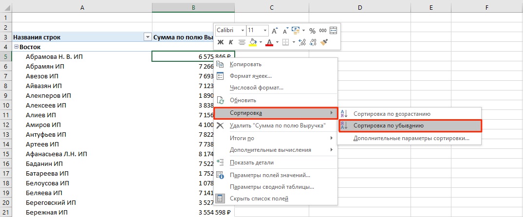
In the resulting table, we can determine what place the client of Ludnikov IP takes among all clients of the Vostok region.

There are several options for solving this problem. You can move the “Region” field to the “Filters” area and place customer sales data in the lines, thus reflecting the data on revenue only for customers in the East region.